Graph pane
Graph panes
The main pane contains a graphical visualization on how people in your case were communicating. Lines in this graph mean communication occurred in a form of a chat, a call, an SMS, a voicemail or an email, so you can easily see who was talking with whom.
At the top of this window, you can see a separate toolbar, which helps you to configure Connection Graph appearance:

There are following items available:
- Icons
 . This button switches the vertex view mode from dots to icons. In icon mode, all contacts or entities are shown using application icon. For example, if communication was performed using Outlook, the Outlook icon will be shown. If multiple apps were used, a blue person icon will be shown (as on the picture below). Besides, since many communication apps are using avatars for a profile owner, Belkasoft X can extract and show these avatars in Icons mode.
 - Dots
 . This button switches the vertex view mode from icons to dots. Icon view can take a lot of space, especially when avatars are shown; while Dots view mode helps to use screen space more efficiently
Note that in both Icons and Dots modes bigger icon and dot mean more significant person: having more communications and connections than others. You may want to start your investigation with these entities.
- Detect communities
 . This button starts a procedure of detecting groups of tightly connected people, which are called a "communities" in Belkasoft X. A community in this reference consists of people, who probably know each other very well. They also may not know people of another community (or know them not as well as people of the community to which they belong). An example of community could be a group of friends, co-workers sitting in the same room, or a criminal group. Belkasoft X employs a proprietary scientific algorithm of community detection, which is based on how people were communicating with each other. Some forms of communications are valued over others to improve correctness of detection. Once community detection is complete, a colored graph with various colors, as on the picture below will be displayed:
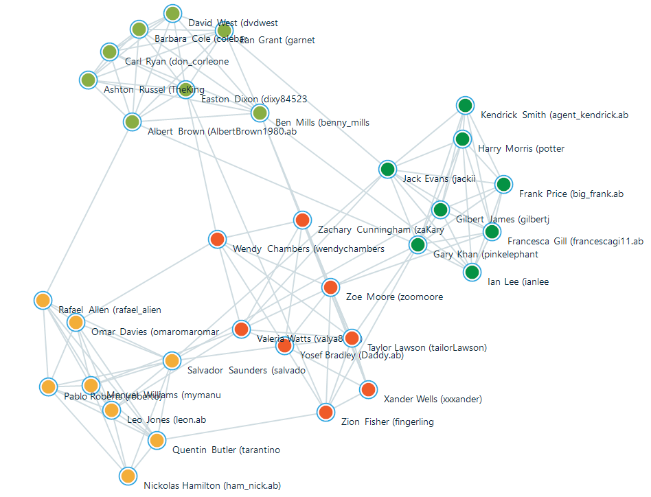
Here you can see four communities
- Rebuild layout
 . If for some reason you do not like the way the graph is currently presented, you can use this button to rearrange it automatically. If communities are detected, Belkasoft X will try to keep community vertices together. You can also drag graph vertices using mouse
 - Show/Hide titles
 . This button shows or hides vertices title (corresponding contact or entity name)
 - Add a filter
 . Filter the graph by different criteria, such as contacts shown, data source, type of communications, and so on. For more on this, see "Filtering data lists"
 - Filter selected nodes
 . This button hides all vertices of the graph except for selected ones, when you wish to focus on just one part of the picture
 - Filter selected nodes and neighbors
 . This button hides all vertices except for ones you have previously selected and ones connected to them with an arc (that is, persons, which were in contact with selected ones)
 - Hide selected nodes and neighbors
 . This button hides selected vertices from the graph
 - Entities with less than X communications will be hidden
 . This control defines communication threshold, the minimum number of communications an entity needs to have in order to be shown on the Graph pane. By default, it is 0 and all the entities are displayed.
After you filtered (hidden or shown) some vertices of the graph, you can revert to the original picture by resetting corresponding filters. For more this subject, see "Filtering data lists".
Once you have configured the way you would like to see the graph, you can start investigating connections between persons. You can click on any contact or entity in the graph to review its properties. The selected item is highlighted with yellow circle and its properties are shown on the right pane (contact properties pane). When a contact or entity is selected, all its communications are highlighted so you can easily distinguish with whom this entity was communicating:
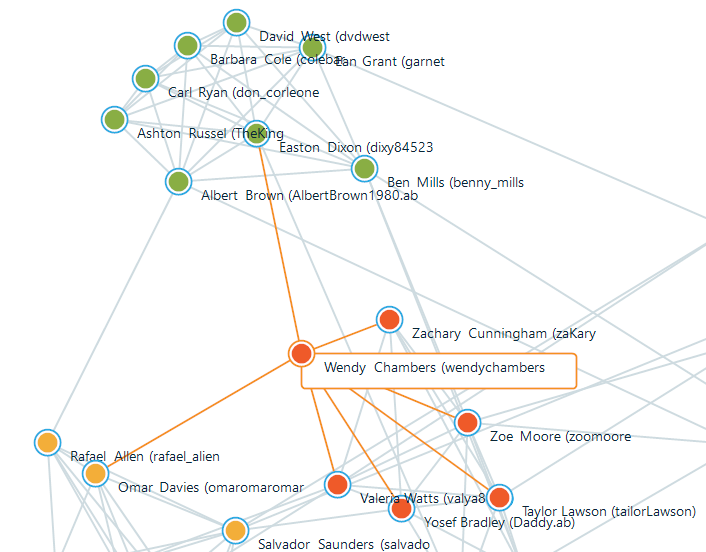
You can see selected entity (surrounded by the yellow circle) and its connections (lines colored in orange)
If you select a connection, at the right pane you will see both participants and all communications between them.
See also:
Connection Graph
Contacts and entities
Contact or connection properties pane